

Project overview
GD Games is an Australian video game e-commerce platform. The mission was to explore a redesign solution to create a more user-friendly, visually cohesive, and intuitive experience across desktop and mobile platforms, targeting both nostalgic and modern gamers while reinforcing brand credibility.
Role
Product Designer
Timeline
Feb - Jun 2024
Team
2x Product Designers
Key Skills
Ideation, User Research, Prototyping, Journey Mapping, User Persona
Buying video games online should feel as exciting as playing them.
THE solution:
We want our redesign proposal to be a game-changer.
How did we get there?
User Interview
What does the typical journey look like for someone hunting for a good deal on games?
To gain insight into user behaviours, motivations, and frustrations when shopping for games online, I chose to conduct 5 moderated in-person interviews. This method was selected as it enabled us to:
Validate initial assumptions early
Seek clarification and ask follow-up questions on the spot
Observe user emotions and tone
Gain rich qualitative data through real-time conversations with the user
Key Insights:
5/5 interviewees emphasized the importance of clear pricing and visible discounts when browsing—users want to quickly spot the best deals without clicking through multiple pages.
5/5 interviewees prefer websites that have filters and sorting tools to help them narrow down games by platform, genre, or price range.
4/5 interviewees said they were more likely to continue shopping if the checkout process was simple and didn’t require creating an account.
3/5 interviewees felt that overly busy homepages can be overwhelming and make it harder to find what they want.

Usability Evaluation
How effectively can users complete key shopping tasks on the current GD Games website?
To evaluate how well the current GD Games site supports users in completing essential tasks, we conducted an evaluation guided by Gestalt principles. This method was chosen because it allowed us to:
Evaluate user experience without requiring a live test
Diagnose usability issues based on guided visual principles
Surface gaps between interface intent and actual user perception
Key Insights:
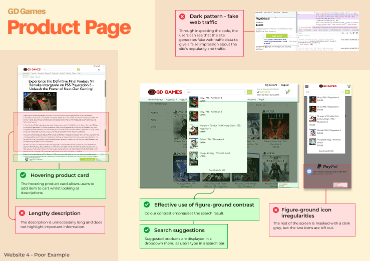
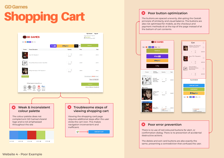
Poor use of proximity and alignment on the homepage made it difficult for users to distinguish between sections. This broke visual hierarchy and led to confusion when scanning for deals or product categories.
Inconsistent icon styles and shapes (e.g., menu vs. cart) disrupted the principle of similarity, making the interface feel unpolished and reducing user trust in the brand’s legitimacy.
Excessive elements and disorganised spacing across multiple pages violated the principle of continuity, causing friction in the user’s flow from product discovery to purchase.
The lack of figure-ground contrast in several sections (especially the footer and promotional banners) weakened readability and caused key information—like privacy policy links and discount labels—to blend into the background.
Our Retrospective Reflection:
We recognised that this method can sometimes exaggerate the severity of certain problems. Because it is an expert-driven analysis, it does not always reflect how real users interpret or respond to the interface.
Some of these may have a minimal impact on actual task completion. It's important to balance these findings with real user insights to avoid over-prioritizing aesthetic or theoretical flaws.
Example Evaluation Pages

Competitor Analysis
How do competitors design their shopping experience?
To understand industry standards and uncover opportunities for differentiation, we conducted a comparative analysis of three Australian gaming e-commerce websites: The Gamesmen, The Game Experts, and Games We Played. Our goal was to:
Identify effective patterns in layout, navigation, and filtering
Highlight design choices that either supported or hindered usability
Recognize missing opportunities in the market that GD could offer
Problem Statement, persona
Add breakpoints to your blank page, then drop sections to have them responsive out of the box.
Exploring Early Concepts ✏️
I designed iteratively through sketching, low-fidelity wireframes, and “How Might We” prompts, which helped uncover creative solutions and avoid poor design decisions early in the process.
Low-Fi Iterations
Rapid Ideation
Brainstorming
I utilised SCAMPER during the Crazy 8s exercise to explore a diverse range of ideas, each taking a radically different approach to the homepage experience.
Each distinct homepage concept experiments with variations in navigation, promotional hierarchy, and content grouping.

'How Might We' Questions to prompt user-centric idea exploration
Based on our research, I generated some 'How Might We' questions from the issues users experienced. I then used affinity grouping to categorise these questions. This helped conclude that navigation is a critical aspect to improve.

Low-Fi sketches
From the brainstorm, the other designer and I each selected two promising directions to develop further—refining them into more complete sketches with annotated full interaction flows to guide the next design phase. We paid extra attention on improving navigation and informational hierarchy.


Annotated
Concept Sketches

Wireframing

Wireframe
Before diving into high-fidelity visuals, I created low- to mid-fidelity wireframes to explore key layouts, use flows, and information architecture. These wireframes helped me rapidly iterate on structural decisions — ensuring the interface was intuitive, responsive, and aligned with user needs uncovered during research.
Mobile-first approach
I designed mobile-first to prioritise accessibility, responsiveness, and simplicity on smaller screens. This method was also helpful in managing time constraints.

Final Wireframe

Refining ✏️
We designed iteratively through sketching, low-fidelity wireframes, and “How Might We” prompts, which helped us uncover creative solutions and avoid poor design decisions early in the process.
Art Direction & Mid-fi
Digitized wireframes of selected designs
Demonstrates layout, user flow, content placement without full visuals
Includes multiple iterations of key screens to test structure before visual styling
High-fi tweaks & comparisons
Digitized wireframes of selected designs
Demonstrates layout, user flow, content placement without full visuals
Includes multiple iterations of key screens to test structure before visual styling